Monday, June 29, 2009

Museums and Relevance: What I Learned from Michael Jackson


Where were you when Michael Jackson died? By a strange and lucky coincidence, I was at the Experience Music Project and Science Fiction Museum (EMPSFM) in Seattle for a two-day workshop. EMPSFM is one of a handful of museums worldwide for which the death of the King of Pop is a very big deal. On Thursday afternoon, our workshop fractured as curators, educators, media producers, and marketing staff scrambled to talk to press and put together spur-of-the-moment exhibits and tribute programs.

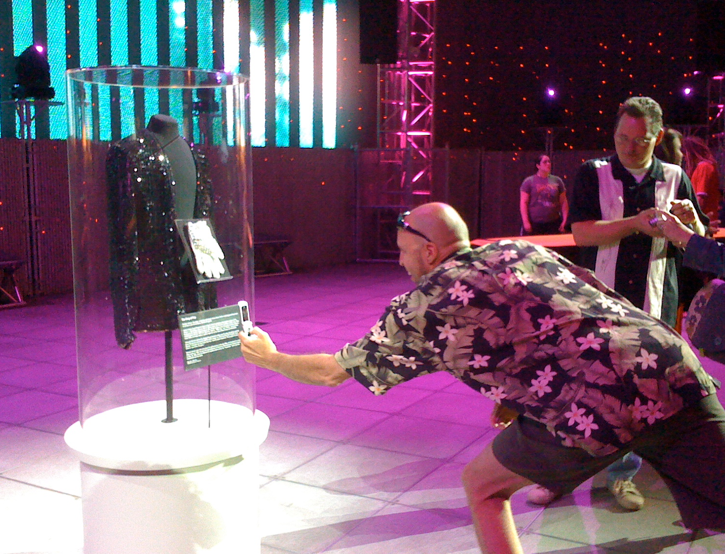
Within 24 hours of the news, the EMPSFM staff hosted a tribute event at a local music venue and mounted an exhibit of Jackson's iconic glove/jacket along with archival concert video in a free public area (appropriately called the Sky Church). They staffed talk-back tables where visitors could write on butcher paper, and outside the museum, they put out boxes of sidewalk chalk to invite people to share their thoughts. They also featured a memorial (and a talk back opportunity) on their website.

I spend a lot of my professional time trying to develop compelling opportunities for visitors to share their thoughts and connect with content that is deeply relevant to their immediate needs and interests. I watched this happen magically and easily for hundreds of people on Friday at EMPSFM, folks of all ages and backgrounds intently taking photos, writing messages, and talking to their friends. It was a rare moment where the cultural and historical importance museums tend to bestow on all exhibits was sought and appreciated by the public. "Yes," every camera and curator and chalk scrawl and family seemed to agree. "This Matters."

There's nothing new about museums serving as spontaneous memorials or providing support in emergency situations. The question is what happens after the news cycle is over, after the urgency diminishes. It's wonderful to see a museum as useful and energized as I saw EMPSFM over the past few days. But what about the rest of the year? Are museums only relevant when they can serve our most pressing needs? And if so, should they seek more opportunities to serve these needs?

I ask these questions amidst recent calls for museums to become more responsive, demand-driven institutions. Elaine Gurian has been speaking and writing about museums as soup kitchens, suggesting that museums should consider new uses of their spaces to provide direct social services to people, especially during the economic downturn. Many potential services, like job training and subsidized food programs, would be incredibly valuable to communities but are foreign to current museum practice. Elaine argues that we should stop worrying about whether these new programs fit the "business of museums" and instead consider whether the business of museums is sufficient to the extraordinary community needs of the day.

I struggle with Elaine's argument. I agree that most museums do not actively and aggressively seek out ways to truly serve the needs of their visitor communities (as opposed to donor communities). For example, museum spaces are often dormant for many hours of the day, and the most basic functions offered--beautiful spaces, clean restrooms, opportunities for food service and event production--could be employed to provide a huge range of community services. Hours before Michael Jackson died and it became the memorial site, I was talking with EMPSFM staff about the under-utilization of the Sky Church, an unusual and impressive public space. And awesome examples like 826 Valencia or the Boston Children's Museum's GoKids program demonstrate that sometimes putting traditional social services like tutoring or food distribution in a cultural context can destigmatize them.

But I also think that museums (like all organizations) need to focus both on who they are for and what they are about, balance the needs of their audiences with the goals of their institution. I'm as interested in how we can find connections between what people need and starting points museums already have--revealing or amplifying relevance--as I am in providing new services for peoples' needs.

It is apropos that the EMPSFM workshop was focused on how the museum can deepen relationships with teen audiences. We weren't talking about bamboozling teens with some hip marketing campaign; instead, we focused on ways that programs which currently serve just a few teens could empower and enable many more teens who are passionate about making music, reading science fiction, and sharing niche interests. We were looking for ways not just to provide more services to small groups of teens but to develop platforms where teens could support and serve each other. And we spent equal amounts of time talking about teens and their needs as we did talking about programmatic responses to support them.

Do these teens need EMPSFM to survive? Probably not. Does anyone need Michael Jackson or Ursula LeGuin or her guitar to make it through the day? EMPSFM may be frivolous in the face of world economic collapse, but it still delivers services that are relevant to some aspect of peoples' lives.

Michael Jackson belongs at EMPSFM (and visitors knew to find him there) because that museum is about pop culture and specifically music. The museum has physical items relevant to his life that served as connection points to visitors' pain and nostalgia. EMPSFM has contextual content that places a dislocative event into a familiar global story. And they have expertise and authority to connote a particular kind of permanent value to the news.

The flipside of this specificity is that when something non-pop culture-related happens that is incredibly relevant and important to Seattle residents' lives, EMPSFM probably won't be there. I think I'm ok with that... but I feel tension as I write this. If EMPSFM is never relevant to the majority of their community's needs, there's a problem. If they are always relevant, there's no problem. The reality--for every museum--lies somewhere in the middle. How do you know you are relevant enough?

Museums can't manufacture relevance to audiences. If you are not happy with the extent to which your institution is responsive to community needs, then by all means, change something. But start by honestly and openly assessing which needs you can appropriately serve. I agree with Elaine in hoping that every museum will earnestly try to do more, will spend more time thinking about what visitors need and less time trumpeting what objects are on display. And to me, providing space and chalk for a twelve year-old skater to scrawl on sidewalk about how Michael Jackson changed his life, well, that counts.

Thursday, June 25, 2009

Technology for Experience's Sake: Guest Post by Bruce Wyman

In this guest post, Bruce Wyman, Director of Technology at the Denver Art Museum, shares his process for developing interactive technologies to extend familiar experiences in art museums. You may remember the Denver Art Museum from this post about their newest (highly interactive) exhibit space, Side Trip.

It's a running joke at the museum that I'm frequently the person in the room that doesn't advocate for the very things that I'm responsible for (technology). It's not that I don't firmly believe in the power and potential of what technology has to offer, it's just that so often it's a red herring when we're designing experiences for our visitors. I want the technology to disappear. I want the visitor to have an amazing experience in general at the museum, and not leave thinking some piece of technology was the thing that stood out. More often than not, if the technology is memorable, it's usually in a negative way -- something didn't work as expected.

So, let's make it easy on ourselves and start off by largely ignoring the technologies that we could be using. Frankly, visitors frequently don't care about the technology and I agree with them. Give them something rewarding, some meaty bit of fun and engagement and concentrate on designing what that experience could and should be. Once you get a good sense of that, the technology begins to fall into place and you stumble across new kinds of experiences that have the power to delight the visitor and probably more efficiently serve your original goals.

Of the different sorts of things that we've design at the Denver Art Museum during the last five years, it's unusual that I have a particular technology in mind at the outset (I'm sure someone could easily call me out on that, but let's pretend together, shall we?). Our standard practice is to deliberately ignore the possible implementation and tease out the details of what will make the experience compelling for the visitor. If we're going to show a video, how is that different? What will make the video compelling? Is there a particular *kind* of interaction that's important to satisfy the experience? etc.

At some point, as you begin to think about how visitors might interact with whatever your experience could be, you start to draw on real world analogies and natural patterns of behavior and interaction begin to emerge. The real world doesn't always have the *best* interactions, but it is filled with interactions that people already know and understand. The critical behavior in making the shift to designing in concert with these interactions is to get in the habit of just watching people all around you and how they engage with the rest of the world.

Let's consider a quick possible scenario. I work at an art museum and one of my long term desires is to know what works a visitor finds interesting without having to deliberately make them punch a button or use some piece of technology that interferes with a visitor's rapt
attention with our artworks. In this theoretical situation, my simple interaction goal is to concentrate on the *capture* of information rather than delivering something back to the visitor. I'm simply trying to find a clean way to judge visitor interest.

When I'm a visitor, if I'm interested in sharing something with a friend, I might point at it. If I'm walking around in an art gallery, I'll pause in front of work that interests me. If I'm really interested, I'll lean in or get closer to the ubiquitous tiny label nearby to read a spot of info. Those are all things people already know how to do and have been doing for thousands of years (in the latter example, the thousands of years that art museums have existed, certainly). So, without even having considered the eventual technology application, I've determined that I'm interested in tracking a visitor's location, proximity to known objects, and time spent in a location. I can then begin to consider ways to do that -- vision tracking, possibly sensing a handheld the visitor may be using to gather information, or RFID tracking a membership card on their person. Given privacy concerns, I'm not sure that I actually want to do any of those, but the important part of the process is that I'm defining an eventual solution by the visitors and their interactions, not from the starting point of specific technologies we want to implement.

The Select-A-Chat in our Western Galleries had an interesting evolution. The final implementation is essentially a small theater space in our galleries. As you enter the area, there's a wall projection resting on our jauntily angled interior walls. Next to you is a comfortable sofa and a coffee table in front of it. The top of the table has a graphic depicting a number of artworks from the nearby galleries with different interview questions superimposed. To select a particular topic, there's a coaster-sized metal 'X' that the visitor places on the table. Simply, the whole interaction is described in one sentence: "X marks the spot." If you want a more detailed tour of the Select-a-Chat, check out this video.

The goal of the experience was to interview selected artists and give visitors some insight to their efforts and process. We wanted artists that felt very human and dispelled the idea that the creative process was a magical one but rather took real effort with some days being great, others not so much. The real strength of the overall interactive is the videos themselves, so we recognized early on that we wanted a relaxed environment where the process of choosing the videos largely disappeared for the visitor.

With these ideas in mind, it became substantially easier to brainstorm different approaches to how we might achieve a simplified end result. In an early iteration, we imagined something very direct -- giving voice to the artist -- in which the table would be more akin to an old telephone operator switch board. The different artists would have headphone jacks for mouths and you'd plug directly into the display. Moving on from that, but still with the same idea, we imagined a large set of fabricated lips as being the object moved around on the table. We quickly moved on when we started to imagine the mockups of photoshopped artist faces without mouths and were left with a decidedly unsettling image. The metal 'X' was a response in trying to step back to what the actual mechanism was, but by that point, we had a good idea that the general interaction was right.

Our visitor testing satisfaction surveys support our belief that the experience works well. People find the experience easy to use and at the same time, we've added a little bit of magic to the interface. The visitor *can't* do anything wrong -- if the 'X' is on the table, the experience works. It's easy to figure out and if you watch someone else do it, you learn what to do in an instant.

On a slightly different note, while we spent a lot of time thinking about the experience before getting to the technology, having a solid understanding of our goal let us think through a few permutations of how to implement the technology. At one point, we'd abstracted the interaction design so far that we considered using the building's new security system. The same system is in use at airports around the world and is particularly good at detecting potential terrorist threats -- the system is able to detect a piece of unattended luggage left in a terminal after a certain amount of time. When that happens, the system triggers a video feed in a central control room. Our problem was the same; an object left in a location (an 'X' on the table) triggers a video feed (different artist videos). We ultimately developed an alternative solution when it became apparent the cameras wouldn't have the resolution or view that we required.

Our visitors have responded well to this approach in our technology design. Not only with the Select-A-Chat, but our visitor surveys in general indicate that the Denver Art Museum's interactive components are easy to use, effective, and enjoyable. We don't always get it right the first time, and we've had to accept that, but we do believe in an iterative approach based on what we learn over time. Even better, from an internal point of view, we accept technology as part of the visitor experience and not as a competitive element that happens at the exclusion of other parts of the visitor experience.

Monday, June 22, 2009

What Makes an Innovative Idea Actionable?

What do you do when you encounter a really great and unusual idea, one that you could implement but would require you to change some aspect of what you are currently doing? Do you jump in or do you shelve it? And what distinguishes the former from the latter?

Recently, I've been wrestling a lot with the relationship between innovation and impact. I'm working on a personal project (slowly) to open a cafe/bar venue that is also a design incubator for participatory exhibits. My goals are two-fold: to develop a dynamic, creative, social platform for my community and to distribute its successful elements to other civic learning institutions (museums, libraries, community centers). The further this moves towards reality, the more I'm focusing on how I'm going to serve the people walking in the door and the less I'm thinking about my colleagues. My strategy is: make it work really well, research what works and doesn't, and share the design lessons with the world. If the venue is successful and we share our honest results, won't others want to adopt some of our practices?

Maybe not. I was recently discussing this project with an audience research specialist, Peter Linett, who is working on a related project to encourage experimentation and risk-taking in museum practice. Whereas I'm taking the "make it as awesome as possible and they will pay attention and want to steal the ideas" approach, Peter is trying very deliberately to create a structure that supports participation from diverse museum professionals and museum venues from the very beginning. My model is the shining star. His is the virus.

Which has more impact on your actual daily practice? I draw design lessons from outside models all the time, so "creative thievery" approach feels natural to me. There's a whole section of this blog called Unusual Projects and Influences. Whether it's an online game like Signtific, a tutoring center like 826 Valencia, or an educational event like Living Library, my engineer brain wants to figure out what makes these innovative projects tick and then tinker with those design lessons in my own work.

But I also remember the first time I participated in a RIG (Rapid Idea Generation) session with Julie Bowen, then of the Ontario Science Centre, at a conference in 2004. Julie got about 25 of us incredibly excited about their innovative three-dimensional brainstorming process. We loved it. And then at the end, when she asked how many of us could do this in our own museums, no hands went up. We all felt like the process was too alien to our work environments, too hard to sell, too hard to integrate. We saw that it was brilliant, but we weren't willing or able to make the changes so we could use it.

So that's one big reason innovations don't get integrated: they are just too foreign to our standard practices and work environments. That's an internal barrier--something about ourselves and the way our teams approach new ideas. But Peter pointed out an external barrier I hadn't anticipated: some innovations just don't feel "museumy" enough. Get a few museum exhibit designers talking about their favorite museums and some serious outliers like the Museum of Jurassic Technology and the City Museum will pop up high on the list. And yet, as Peter pointed out to me, if we love those unusual standouts so much, why don't more museums adopt elements of their practice? Peter commented,
I did hear from several people that the museum folks who loved visiting the City Museum when they were in St. Louis were quick to add, 'It's not a museum.' These categorical objections operate on assumptions that aren't really examined, and not just about educational values or the status of objects, but also about the personality and tone that define museums in some minds.
I was somewhat surprised by this. I'd always thought that museums didn't adopt more of the fabulous outlier work because it wasn't decoded in an understandable and actionable way. That's why I required my museum studies students to carefully document their Advice exhibition--so that the learning from that unusual project wouldn't be lost and could be applied in other places.

But Peter suggested that places and projects that are fundamentally not "museum-like" will not have impact on traditional museums. This worries me because the implication is that no matter how successful my venue is at connecting strangers in creative and intellectual play, museum professionals will look at it and say, "that's nice, but it isn't a museum."

The further I go on my own personal design process, the less I care about this issue. I'm enjoying designing a place that I think is going to be successful and a hell of a lot of fun. I realize that it is presumptuous and a little silly to worry about field-wide impact. But I want to keep grappling with this problem, because my ultimate goal IS to make existing institutions more dynamic, relevant, and audience-centered. I'm not interested in creating a whole new set of institutions to replace or compete with the old ones. But I do want to start by pushing from the outside where the ground rules and constraints are different. I want to make a well-documented model to serve as an engine of new physical ideas.

I imagine that many of you who read this blog are interested in outside models for innovation in museums. What does an outside model have to have for you to be willing to take a risk and make some internal changes? Do you need research? Ticket sales reports? Does it need to take place in a venue similar to yours? How can I (or anyone) design a project that is both maddeningly challenging and incredibly useful?

Monday, June 15, 2009

Advice: An Exhibition about Talking to Strangers

Advice BoothIn April, I gave 13 UW graduate students a simple challenge: make an exhibit that gets strangers to talk to each other. 10 weeks, $300, and a whole lot of post-it notes later, they succeeded.

Last month, student Nicole Robert wrote about the concept for Advice: Give it, Get it, Flip it, Fuck it. Now, the exhibit is closed and we're throwing open the doors on what was created. You can explore the project wiki where we coordinated the exhibit, including the project overview, our six-week plan to get it all done, and individual sections for development of concept, content, interaction, graphics, marketing, fabrication, installation, and evaluation. There is also a final evaluation report available for download, which offers lots of great quantitative and qualitative content about what visitors did in the exhibit. It also includes reflections from the exhibit team on the project.

I recommend you check out the wiki and evaluation report to dig deeply into the content. Below are three things I learned from the Advice exhibit and will take with me into future work.


Facilitated/Unfacilitated Blend

When we started this course, I really pushed the students to think about ways to induce unfacilitated interactions among strangers. I love facilitated experiences, but I worry that they aren't scalable to every visitor. In the end, the Advice exhibit offered four main experiences--two that were facilitated, and two that were unfacilitated. The facilitated experiences were an advice booth, at which you could receive real-time advice from children, money managers, tattoo artists, and more, and a button-making station, where a gallery attendant would help you play a simple game to make a custom button featuring your own advice "madlib" composed of your own nouns and verbs rolled into classic advice phrases. The unfacilitated experiences (discussed in more detail below) involved visitors writing their own pieces of advice on post-its and walls and answering each other's questions asynchronously.

At any time, there were two facilitators in the exhibit--one for the advice booth, and the other for the buttons. This might make Advice sound more like an educational program than an exhibit, or like a failure on the unfacilitated front. But the exhibit team did something novel. First, they replaced staff with volunteers--some entirely spontaneous--at the advice booth. Like the Living Library project, the advice booth was a platform that connected strangers with strangers--not just staff with strangers. One eight year-old enjoyed the advice-giving experience so much that he came back the following day for another shift in the booth!

Maybe more importantly, the facilitators were not the center of the Advice experience. They were roped to very specific locations and activities. Because they were a part of the experience rather than the focal point, they could impart an air of friendliness and participation without making people feel that they had to participate. They reminded me of street vendors or great science museum cart educators, imparting an energy to the space without overwhelming it. I know that floor staff are expensive, but they really make a space come alive (see this post). And in Advice, the activities for staff were interesting and specific enough that a really eclectic mix of volunteers could perform them successfully.


In Praise of the Post-It


There's lots of post-it-powered art on the web these days (like this and this). I'd like to add my ardor to the pack and suggest that you really can make a compelling, content-rich interactive exhibit experience with a bunch of post-its. In Advice, the setup was simple: the exhibit team came up with a few seed questions, like "How do you heal a broken heart?," and put them up on signs behind glass. Then, they offered different shapes and colors of post-its, as well as pens and markers, for people to write responses.
Post-it Interaction
The engagement in this part of the exhibit was very high. Random passers-by got hooked and spent twenty minutes carefully reading each post-it, writing responses, creating chains of conversation and spin-off questions and pieces of advice. It's worth noting that the exhibit space was not exactly optimal--it was a hallway separating the lobby of the student center from a dining hall. The previous exhibit in this space was a very provocative art exhibit about sexual violence, and yet in our brief site survey in April we saw almost no one stop to look at the art. Not so for the post-its. The Advice exhibit hooked maintenance staff, students, athletes, men, women--it really seemed to span the range of people passing through.

There were 230 responses to the nine staff-created seed questions, and in a more free-form area, visitors submitted 28 of their own questions which yielded 147 responses. Some of the advice was incredibly specific; for example, one person wrote a post-it that asked, "should my 17 year old who is going to college in the fall have a curfew this summer?" That post-it received 9 follow-up post-its, including a response from another parent in the same situation. Others stood and copied pieces of advice (especially classes to take and books to read) carefully into their personal notebooks.

It might seem surprising that people would take the time to write up questions on post-its when there is no guarantee that someone will respond, and very low likeliness that someone will respond while you are still in the gallery. The exhibit experienced low traffic overall in an odd area of the UW student center. But the impulse to participate was high and the threshold for doing so was very, very low. The post-its and pens were right there. The whole exhibit modeled the potential for someone to respond to your query, and as it grew, the sense that you would be responded to and validated grew as well. We saw many people come back again and again to look at the post-its, point out new developments, laugh, and add their own advice.

People felt very comfortable not only adding their own advice but also critiquing others'. We saw many instances when someone would write "lol" or "love this" directly onto a previously posted post-it. People also asked follow-up questions. For example, one person recommended "grappa and Bessie Smith records" as a cure for a broken heart, to which another responded, "Who's Bessie Smith?" The query was answered by yet a third person, who wrote, "Uh, only the greatest singer of the 20's 'I need a little sugar in my bowl.'"

Do I know if the second person ever came back to find out who Bessie Smith is? No. But I know that the resultant conversation provided information to many subsequent visitors to the space. It's like following blog comments. Not everyone comes back to read the evolving comment stream, but the aggregate is always valuable to the next visitor.


Many Ways to Talk Back


When the student team inserted a "bathroom wall" component into the exhibit plan, I didn't really understand it. If visitors could write on post-its anywhere in the exhibit, why did they also need a place to scrawl with marker on an actual wall?Advice Exhibit Bathroom Wall

But the bathroom wall turned out to be a brilliant exhibit element. It was a release valve that let people write crude things and draw silly pictures. The bathroom wall was "anything goes" by design. And while the content on it was not as directed and compelling as that on the post-its, it served a valuable purpose. There was not a SINGLE off-topic or inappropriate submission on the post-it walls. They were totally focused on the questions and answers at hand. I think the bathroom wall made this possible by being an alternative for those who wanted to be a little less focused and just have fun with sharpies.

The Advice team also offered a guest comment book (sparsely used) for people to offer comments about the whole exhibit. There were also multiple ways to follow up or submit content online or by phone. All of these ways together constructed a landscape of visitor participation that supported a large number of people participating in ways that felt most appropriate for them.

This is a good lesson for museum talk-back design. If you only offer one place where visitors can contribute their thoughts to an exhibition, they are likely to use that opportunity to share their thoughts on all kinds of things. I've visited many exhibitions that ask focused questions at the end, and visitors respond with more general thoughts about the entire exhibition or museum. These contributions are valuable, but they erode the focus of the topic at hand.

In Advice, there were many forms of talk-back: the post-its, the bathroom wall, the book, the phone, the website. Each of these took pressure off the others as a visitor participation outlet, and the overall result was a coherent, diverse mix of on-topic visitor contributions.


What advice do you have for ways we might advance the practice of exhibit design for social interaction?

Friday, June 12, 2009

Don't Join the Conversation if You Aren't Ready to Listen


Whenever I work with an organization that says they want to “hear from visitors,” I always ask: what will you do with what you hear? Is this a research project? It is an exhibit of user-generated content? Is it a conversation? What will you do if they say something you don’t agree with? In almost all cases, museums assure me that they want to be in conversation, that they want to be responsive, that they want to “really hear” what people think.

This week, I read two stories about disagreeable flare-ups between institutions and consumers. In one case, the institution jumped into the conversation and converted an ugly situation into a positive community outcome. In the other case, the institution was unwilling to engage in the conversational environment and ended up isolated, fueling the fire.

Sadly, it was the second story that was about a museum. Let’s start there.

Here’s what happened: an art critic named Jerry Saltz posted an incendiary note on Facebook about the very low representation of women artists on the 4th and 5th floors (painting and sculpture) of MoMA. He encouraged his friends and followers to help him generate a package of comments and complaints on this topic to send to museum executives at the end of June. Then, he received a message from MoMA’s Chief Communications Officer, Kim Mitchell, which he posted (at her request). Here’s her message:
"Hi all, I am (Kim Mitchell) Chief Communications Officer here at MoMA. We have been following your lively discussion with great interest, as this has also been a topic of ongoing dialogue at MoMA. We welcome the participation and ideas of others in this important conversation. And yes, as Jerry knows, we do consider all the departmental galleries to represent the collection. When those spaces are factored in, there are more than 250 works by female artists on view now. Some new initiatives already under way will delve into this topic next year with the Modern Women's Project, which will involve installations in all the collection galleries, a major publication, and a number of public programs. MoMA has a great willingness to think deeply about these issues and address them over time and to the extent that we can through our collection and the curatorial process. We hope you'll follow these events as they develop and keep the conversation going."
This message spurred hundreds more comments on Facebook, blog posts, and tweets, which eventually made their way to people like me. As Doug McLennan wrote in Arts Journal, Kim’s message was condescending, impersonal, did not respond to the specific issue at hand, and did not reflect an honest interest in engagement. Though she wrote, “we welcome the participation and ideas of others in this important conversation,” Kim made it clear that MoMA will continue to talk about this issue internally, on their own, and we should just wait and “follow” their subsequent actions.

MoMA is present on many social networks, including Facebook and Twitter, and clearly “heard” from people about this issue. But only Kim was tapped to address it in a corporate manner. Despite offering conversational portals, MoMA was unwilling to engage conversationally in this case. It would have been very easy to send out a tweet or Facebook update with a link to the article and some version of the question, "what do you think?" so that MoMA could become part of the discussion. I presume that their silence on the airwaves means MoMA doesn't have a policy that allows staff to engage in these environments in the open, personal, conversational ways that are appropriate to the platforms when the topic veers away from positive comments and event announcements.

There are people on Jerry Saltz’s page and other venues having very passionate, engaging conversations about how to deal with gender representation issues in MoMA and other museums. It’s not like the gender issue is a big secret that Jerry exposed or that this topic isn't heatedly discussed inside and outside the museum world. But MoMA isn’t ready to participate with the public on these potentially tough, meaty conversations. They don't have the resources or policies to support real dialogue with the public, even if they are present in social media-land. They may be in Rome, but they’re not ready to do like the locals.


But don't despair. There is an alternative for those who are really ready to hear from visitors: engage responsively in an invested, honest, personal manner. That’s what Dave Schroeder did this week when he was in a similar position to MoMA.

Dave runs a yearly software conference called Flashbelt in Minneapolis. Like MoMA's upper floors, Flashbelt has a significant gender imbalance with about 5-10% of attendees being women. One of the keynote speakers, Hoss Gifford, gave a talk that many perceived as sexist/degrading/offensive and completely unprofessional. A female attendee, Courtney Remes, wrote about the experience and the managers of the Geek Girls Guide blog posted her comments along with a comprehensive call to action to encourage people to write to the event organizers and generally raise awareness about the issue.

The same day, Dave Schroeder wrote privately to the women and, significantly, posted a public apology about the incident on the Flashbelt homepage. He didn’t hide it on a secondary page; one day after the conference was over, the homepage of the conference focused solely on this issue. His statement was honest and explicit. He validated the concerns, apologized to everyone, took full responsibility for the issue, and expressed his commitment to redress this issue now and in the future. (Note: his letter has now moved here.)

The next day, the Geek Girls post was updated to announce that there would be a united response from Dave, Courtney, and the Geek Girls coming soon. Here’s what they said:
“Dave Schroeder, Courtney Remes, Nancy Lyons and Meghan Wilker met this morning and had a great discussion. We're working together on a united response, which will be posted here as soon as it's done. This has obviously touched a nerve with a lot of people. Let's keep the dialogue going, and let's keep it positive and respectful.”
They met in person. They talked about it. This afternoon, they issued a lengthy collaborative statement. And they are encouraging more dialogue about the general issues of gender imbalance and prejudice in the software development world, which they are clearly willing to lead and take part in.

This is the way that institutions should be willing to act when we say we want to “be responsive” to people. I know there are many differences between the MoMA and Flashbelt incidents and that running a huge museum is much more complex than running a yearly conference. But the issues these stories bring up around willingness to "hear" and "engage" are universal.

This is why I always say that participatory tools are about relationships, not technology. You have to be honest about what kinds of relationships you are willing to take on. If your corporate culture prevents you from being an invested, accountable, honest, personal part of a serious conversation, then there are some conversations, relationships, and social venues in which you cannot fully participate. And it’s fine if you know you are not ready to be there. It's entirely your choice to engage or not in different kinds of relationships. But don’t show up for a conversation if you aren’t ready to listen.

Tuesday, June 09, 2009

How to Develop a (Small-Scale) Social Media Plan

Yesterday, I enjoyed three hours of graduate students' presentations of social media plans for museums in the Pacific Northwest. I've been working with these UW museology students for the past quarter, and each partnered with a local client institution to develop a social media plan either for a particular exhibition, program, or initiative, or for an entire institution.

Here is the process I offered them for developing and writing these plans. It can be used internally by staff, or externally (as in the students' cases) as a consultant with a partner organization. There are three parts: the institution or initiative's content and audience goals, the institution's assets, and the project concept that will match goals to resources in an achievable way. In most cases, parts 1 and 2 were discussed in a meeting as background research, and then the project idea (part 3) was presented back by the project developer for feedback from the larger team. It turned out well, and I hope it's useful for you.

Part 1: Define your goals.
  1. What is this institution or initiative all about? Who is the target audience? These questions should focus and filter your planning more than anything else.
  2. What kind of new relationships is the institution seeking? How would the institution like to alter or strengthen its relationship with the target audience? What kind of relationship is sought? Relationship types may include: broadcasting, spreading, listening, sharing, embracing, energizing, supporting, research, exchange, conversation… Ideally, you will pick one or two relationships that seems appropriate to the mission and goals, although institutions that are looking at comprehensive media plans may need documentation and ideas in several relationship buckets.
Part 2: Define your resources and boundaries.
  1. What resources (time, money, and people) does the institution have to support this effort? What rules or control issues may prevent certain kinds of interactions? What are they already doing, what have they tried, and where are they now? These questions should help you define a reasonable scope for the project and hone in on some tactics that may be more appropriate than others.
  2. What is the institution's intent with regard to its desired audience? How will they manage, grow, and respond to their newly energized communities? You need to make sure you are recommending something that the institution can honestly, enthusiastically, and appropriately manage in the context of their work processes etc. This is very hard to ascertain from the outside, but asking questions like, “what will you do with visitors’ contributions?” or “what will you do if someone posts something that is inaccurate?” can help.
Part 3: Develop the ideas and explain the plan.
  1. Share your brilliant ideas. What are you recommending and why?
  2. What are the startup needs? What will the institution have to do to get this going?
  3. What is the promotion plan? How can the institution reach out to the target audience?
  4. What are the maintenance needs? What will the institution have to do to keep it going?
  5. What is the evaluation plan? How will this project be tracked and tested against the goals? How will you establish benchmarks and a starting baseline?

Upon review of the final social media plans, I was particularly impressed by the extent to which the students really took to heart the specific resources and constraints of their client museums to create realistic, achievable (and creative!) plans. For example...
  • Jill Hardy worked with a museum that is trying to attract a younger, more diverse adult audience. Recognizing that the museum is situated in a highly walkable, hip neighborhood full of representatives of the target audience, she recommended a highly localized campaign that gets the museum thinking "like a neighbor" and becoming a cultural block party/bbq hub for a tight geographic area.
  • Nicole Robert worked with a new institution that would like to deepen relationships with members and energize continued membership sign-ups online. Noting that the museum is at a very early stage in development and is still learning about its' audiences' needs (and getting their feet wet on the Web), she recommended a three-phase plan for both internal online skills development and external audience research and pilot projects.
  • Kylie Pine worked with a small, traditional history museum very unfamiliar with social media but interested in embarking on online discussion. She tied each digital idea to a physical concept with a well-understood historical significance, such as a time capsule and a hope chest.
  • Erin Milbeck worked with an innovative art space that has had a hard time attracting local audiences in a suburb fairly unfamiliar with contemporary art. She combined the challenge of limited time resources and the asset of a huge downtown storefront to recommend a window sign strategy that would introduce people to the space via text messaging.
  • Kathryn Fromson worked with a traveling exhibit developer who would like to connect audiences at different venues to each other and to online environmental information related to sustainable choices. She developed a physical take-home piece that connects any version of the traveling exhibit to a centralized website with both local and shared resources.
Every project focused on the reality that--as with any other initiative--social media plans should not be all things to all people. As much as the students offered client museums great ideas, they also offered peace of mind in the oft-repeated recommendation that institutions not do everything and be everywhere, but focus on a few things that are really tied to goals and mission. Go forth and do awesome things. And relax. You can do them one at a time.

Friday, June 05, 2009

Think Like a Game Designer

I've been designing game-like experiences with museums for a long time. But this week, I participated in a game design workshop with Ken Eklund that totally changed my perspective. My starting point is interactive exhibit design; Ken's is game design. Getting a peek into how he approaches his work induced three aha moments related to prototyping, visitor entrypoints, and designing for maximum impact.

AHA #1: If you abstract far enough, you can prototype interpersonal interactions very quickly.

Ken led us through an activity in which we crowded around a table and watched six people play a quick card game called Pit. As they played, we talked openly about how the game was progressing. We observed and played many rounds of Pit, swapping in and out of the game seats. We talked about the strategies different players were using and tried to determine the most effective winning strategy based on our limited data. Finally, we developed several variations and played rounds with our own new rules.

This is, of course, a form of rapid prototyping. I've spent many hours watching people scratch their heads and bang on interactive prototypes. What stuck out about this experience was putting the focus on the interpersonal gameplay and interactions rather than the content experience. We didn't watch to see if people could "figure it out" or "get the answer." Instead, we watched to see how people pursued different strategies and how comfortable they were with different types of interaction.

We could also iterate incredibly quickly. Pit is a highly abstracted card game meant to simulate commodities trading. Because the infrastructure is so simple (just a pack of cards) and a round lasts only a few minutes, it was easy to change the rules on the fly. I've always believed in prototyping at the simplest level possible, but when it comes to group dynamics we often argue that without a full-size model or the actual space, it's hard to see how people will really interrelate. Pit proved to me that this isn't true. With a table, some chairs, and a set of cards, we were able to make some serious insights about how to affect the speed, energy, cognitive requirements, and overall nature of the game.


AHA #2: Visitors have strategies.

While watching Pit, we openly talked about strategic approaches to the game. David's strategy was to make as many trades as possible. Irina's strategy involved hoarding cards and only making high-value trades. In the context of a game, it's obvious that individuals play with some kind of strategy. Some people optimize their strategies to win, others to have a good time or explore a new aspect of the game.

We rarely talk about this when we design museum exhibits. We expect that visitors will intuit our intended strategy and play accordingly. This doesn't make sense. Games are more interesting when there is more than one viable strategy; that's why we graduate from Candyland to chess. Rather than designing a prescribed "correct" path through an interactive exhibit, we should be thinking more about the rule sets or platforms we can design that will invite visitors to successfully bring personal strategies and modes of interaction to the experience.


AHA #3: You can design interactions to encourage "playing well," i.e. in accordance with your organizational values.

Supporting multiple strategies doesn't mean you can't affect the way people play. We were amazed to realize that a simple change in the rules could transform a slow, strategic game into a fast-paced shouting match. We could change a game that was about diplomacy into one which rewarded cutthroat backstabbing. When we added rules that were well-designed, they fundamentally changed the way that people played the game and the attributes that made the game fun. When we came up with muddier rules, they just confounded the players about the overall goal. In 45 minutes, we were able to make some sophisticated observations about how to change the rules to reflect a wide variety of underlying values or goals.

Ken made the powerful point that many poorly designed games often have a mismatch between what it takes to play well and what it takes to win. Museum scavenger hunts are a classic example of this; we want people to "play well" by exploring obscure areas of the museum, but instead they focus on winning by zooming all over the place without contemplating the objects they seek. Of course, sometimes people have different opinions about what it means to play well--Scrabble enthusiasts will go to war over whether the playing well is about placing elegant word combinations or memorizing all the five-letter words in the Scrabble dictionary.

Ken challenged us to to design interactions to encourage and reward people for playing well. For example, he created a game for the retreat called "Faces in the Crowd" which was designed to encourage participants to meet each other. It had a very simple structure. Each person was given an "identity card" that featured a mashup of two faces smooshed together (see image at top). Your goal was to identify the half-faces on your card and trade cards with others until you were holding a card that featured half of your face. Once you found your partner (the other person attached to your face), you were supposed to determine what the two of you had in common and then present your completed identity set to the game master.

What did kind of values did the Faces in the Crowd gameplay reinforce? It encouraged you to meet new people and literally put names to faces. It forced you to interact with many people, and to work together to try to successfully make a match. And once you found your partner, you spent time talking about what you might possibly have in common (an interest in pyromania, for example). There were various strategies--hunt for a person on your card, ask and collaborate with others, make yourself obvious and hope others will come to you--but the overall experience was one that supported meeting people, expressing interest in them, and making connections (see fun 30-second video).

What does it mean to play well in your museum? Does it mean seeing lots of stuff? Engaging deeply with a few things? Sharing something with someone else? Taking home a memory? How can you reward people not just for following a set path, but for acting in accordance with your overall institutional values? How will you define and reward "playing well?"

Wednesday, June 03, 2009

Forget Conferences. I'm Going to Camp.

I just returned from the Creativity and Collaboration retreat (C2), a NAME/AAM program that I've been helping develop for about a year and a half. C2 brought together 100 exhibit-minded folks on the beach in Monterey, CA for 48 hours of making, learning, playing, contemplating, and celebrating. It was incredible. This is the second time this spring that I've participated in a professional development experience that is more like summer camp than a conference, and I am sold. Paul Orselli wants to dump powerpoint. I want to dump conferences and do these camp thingies instead.

There's a reason people who went to summer camp as a kid are cultists about the experience. It's heady and intense to plunge into a new community that is disconnected from the outside world. At its best, camp is a kind of aspirational play space where you can be yourself away from the stereotypes and burdens of your everyday life. I saw a lot of that at C2, and it allowed me to connect with new people in a space that acknowledged the intersections between personal and professional. Strangers talked about their fears and challenges honestly. The imaginative context of the workshops allowed us to get past petty sticking points and tackle big questions like how to balance creativity into your work, how to feel good about creating without evaluating the product, and how to deal with the tensions of working in teams. We had fun. We got inspired. And most notably (for me, at least), we felt really good about opening up to each other.

For me, most conferences are the opposite of this. Rather than feeling authentic, I feel like I have to project a professional caricature of myself. I'm wearing clothes I never otherwise wear. I'm doing things (hanging out late in bars, distractedly jumping from one conversation to the next) that I rarely otherwise do. I'm being rapidly and frequently evaluated as a one-dimensional version of me, and I'm meeting other people who are struggling with the same self-fictionalization. I get lost in the bigness of the crowds and end up gravitating towards spending time with a few close friends--the ones who "know me." That's great, but I'd much prefer to go on a hike with them than sit in a bar, and few conference experiences support that. I thought I would come home from C2 worn out, the way I feel after most conferences. Instead, my head is buzzing with energy and excitement about work.

When we first started planning C2, we were concerned that no one would come or that people would perceive it as frivolous in a time of extreme stress in the economy and museum industry. We tried hard to avoid designing a "kumbaya" weekend, though as it turned out, participants did spontaneously and unironically dance around a bonfire together. Instead of suffering for sign-ups, C2 was oversubscribed at 100 people, including many who paid their own way. We're already talking about some incarnation of "next time" with great enthusiasm.

And now, having experienced it, I have a different perspective on the frivolity question. Across the board, C2 provided more value to me than a standard conference. I met more new people with whom I have a genuine interest in keeping in touch. I learned more new techniques that I can apply directly to my work. I never had awkward forced interactions with people. There was always something interesting and valuable to discuss. And we got to do it all in a beautiful natural environment. As one attendee said after seeing ridiculously cute baby deer on the path for the umpteenth time, "cue the fawns."

I'm a big believer in seeking balance in your life between the physical and the virtual, the conceptual and the concrete. Taking time away to do professional development of any kind should be an opportunity to readjust the balance and get reconnected with what's been lacking. Most of us spend our work time on computers and in meetings, even if the work we do is ostensibly creative and related to a tactile experience. Most of us spend too much time indoors and sedentary. The frustration I have with conferences is that I wish they would inject more of the physical, the creative, and the active into my professional practice rather than reflecting my standard "sit down, learn stuff, and talk to people" lifestyle. That part of conferences--the content delivery and discussion--could be happily (for me at least) replaced with a digital experience. But the opportunity to build something with my hands with other people, to create mythic exhibits in an hour or redesign a card game or make food sculptures or fly someone in the air (all things I did in the last two days) cannot be digitized. That's how I want to spend my travel money and time. That's how I want to learn to be a better person and a better professional.

I'm not sure at this moment what this conviction will mean for the future. I spend a lot of time at conferences and don't expect that to go away. But if you are interested in helping develop camp-like alternatives to traditional conferences, a "camp" track, let me know. Now that I've seen the fawns, I don't see much reason to turn back.